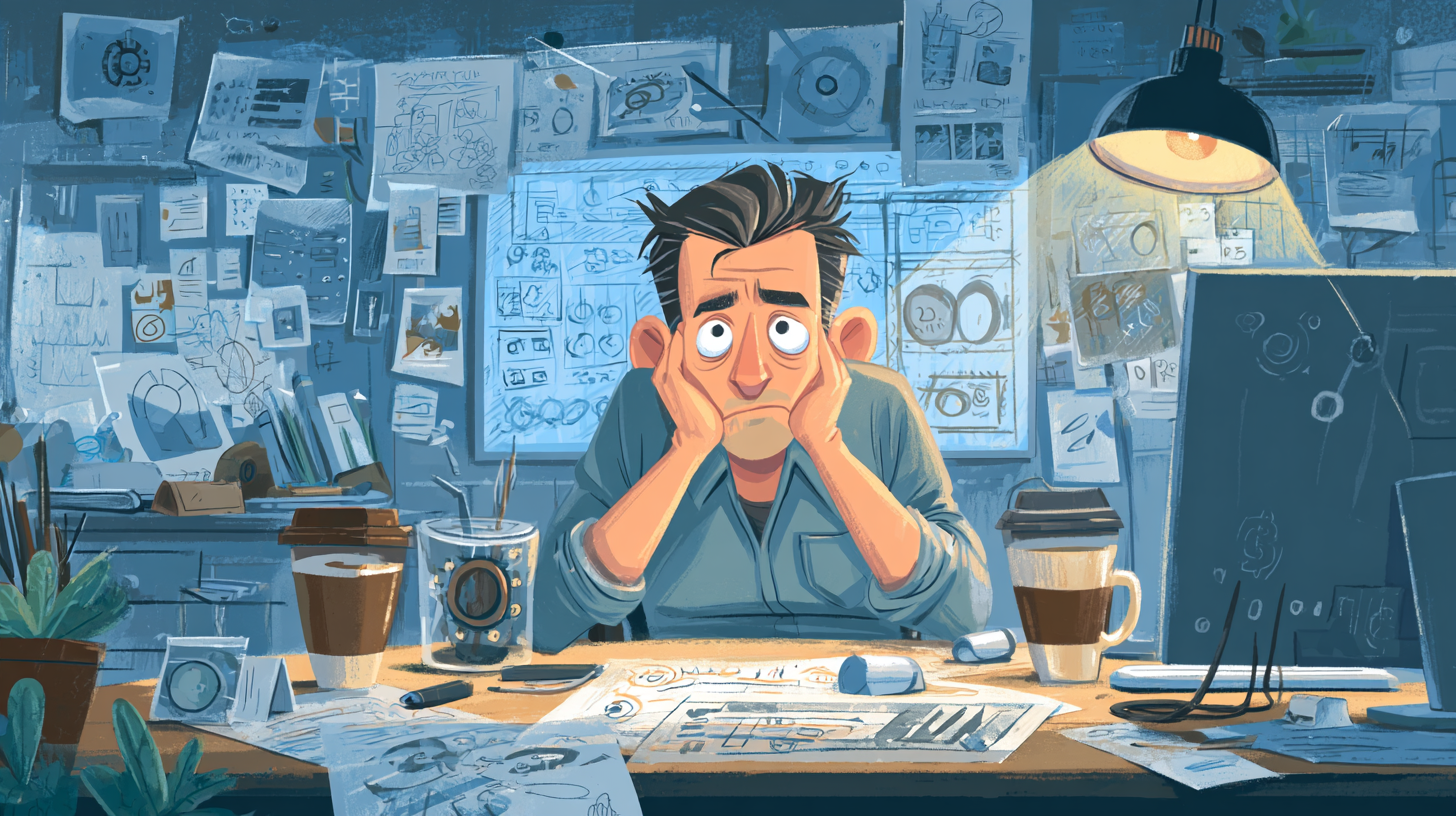
You know that feeling when you meet someone and within a split second, you just know whether they’re put-together or a total mess?
That’s what your logo is doing to your startup every time someone sees it.
Before they click your link, read a line of copy, or even figure out what you sell, they’ve already made a snap decision. That gut reaction? It’s 90% based on what they see first. And guess what? That’s almost always your logo.
At Clutchpilot, we’ve helped enough startups launch to know this: your logo isn’t just a pretty mark it’s your business’s first handshake.
Think People Don’t Judge Logos? They Do. Instantly.
Let’s be honest. When you stumble on a new brand, especially online, what’s the first thing you notice?
It’s not their “About” page. It’s their look and the logo is front and center.
Whether you realize it or not, that image sets the tone.
- Is it professional?
- Modern?
- A bit outdated?
- Hard to read?
- Forgettable?
It all clicks instantly. And from that moment on, your potential customer has already felt something about your business. A good logo makes them curious. A bad one makes them bounce.
What Makes a Logo Actually Work?
Not what you’d think. It’s not about being “fancy.” It’s about being clear.
We’ve seen logos so minimal they feel like a whisper—and others so cluttered, you can’t tell what’s going on. The winners? They all follow a few core rules:
- Simple – you can spot it and remember it, even at a glance
- Versatile – looks good big or tiny, in color or black and white
- Relevant – reflects what the brand actually stands for
- Timeless – not chasing trends, just clean and confident
The best logos don’t try too hard. They just feel right.
Design Isn’t Decoration—It’s Communication
Every element of your logo sends a signal.
Color matters:
- Red? Bold, urgent.
- Blue? Calm, credible.
- Yellow? Youthful.
- Green? Natural, fresh.
- Fonts say things too:
- Serif? Think tradition and trust.
- Sans-serif? Modern, clean.
- Script? Personal and creative.
- Shapes carry meaning:
- Circles = community, connection
- Squares = stability
- Triangles = direction, energy
None of this is random. At Clutchpilot, every logo we design starts with strategy, not just style.
Common Logo Mistakes We See (Way Too Often)
We’ve worked with a lot of founders. And while every brand is different, the same 3 logo mistakes keep coming up:
1. Trying to Do Too Much
If your logo has three icons, five colors, and your full tagline squeezed in—pull back.
If it doesn’t work as a favicon or Instagram profile pic, it’s probably overdesigned.
2. DIY-ing the Wrong Way
We love Canva. Use it for Instagram stories. But your logo? That’s a long-term asset.
It deserves more than a guess-and-go design.
3. No Brand Alignment
Your logo can’t live in its own world. If it clashes with your website, tone, or product style, it’ll confuse people. Everything needs to click.
Let’s Be Honest! Your Logo = Your Reputation
It might feel like something you can do later. After the launch. After the funding.
But the truth is, your branding is the first thing your audience sees—and judges.
Your logo shows people how serious you are. It shows that you care about the details. And in a crowded market, those signals matter more than ever.
We’ve helped startups go from “meh” to “whoa” with just one visual shift. Because when your logo works, your whole brand steps up.
Final Takeaway Don’t Just Have a Logo. Have One That Works.
You don’t need a logo that screams. You need one that speaks clearly.
It doesn’t have to be edgy or artsy or hyper-minimalist. It just has to feel like you.
Confident. Focused. Aligned with what you do and who you’re trying to reach.
That’s what we do at Clutchpilot.
We help brands look as sharp and intentional as they actually are—starting with the logo.
Ready to create a logo that makes the right impression?
Let’s make something that sticks.
Not just in people’s minds, but in their trust.
Work with Clutchpilot →
Comments (1)
I’ve been spending time on Clutchpilot lately, and this article honestly made me stop and think. I never really paid attention to how much a logo can shape people’s first impression of a business. The points here felt real and practical definitely something every startup owner should read.